

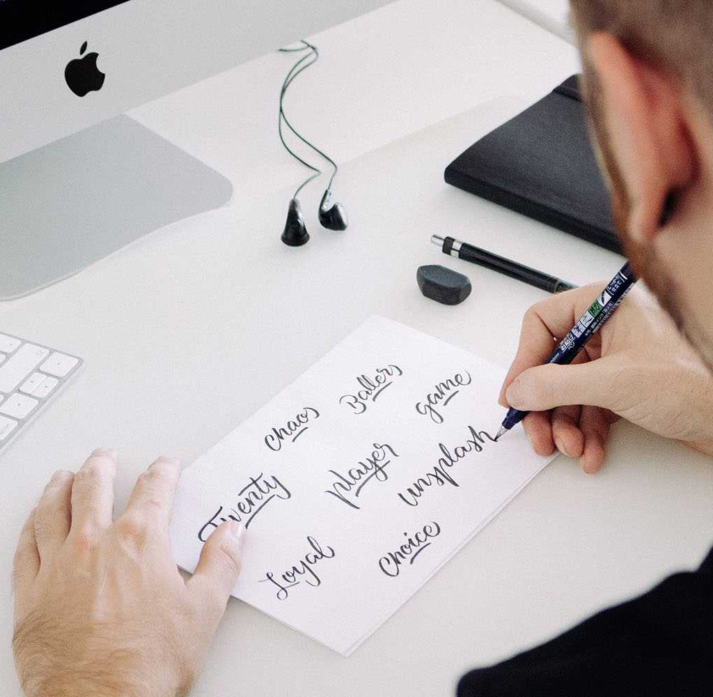
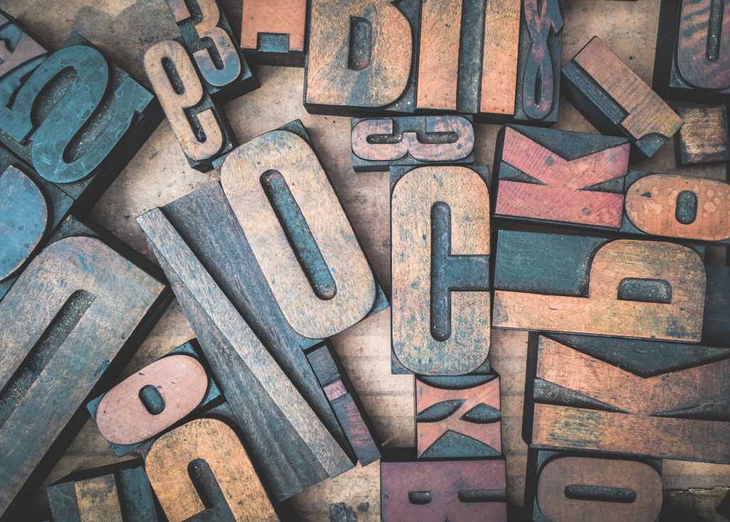
Today we’re going to discuss web fonts.
You can’t begin to measure all of the font options out there these days.
Font databases are chock full of choices, from mundane to so-fancy-you-can-hardly-read, and everything there is under the sun in between. It’s like a proverbial candy store for web designers and enthusiasts alike who tend to get stuck in a wonderland of varying typefaces.
And to add to that, new fonts are added to that wonderland every single day, so there’ll be no rest for the good little researcher.
But with all those choices comes procrastination. Who doesn’t want to spend A LOT OF TIME finding that perfect one for their project?
Not only that, but once you think you’ve found your best match, no matter how lovely or cool looking it is, how easy to read, or how bold of a statement it makes for you, is it really the right font for your website?
And what about pairing that perfect font with others without having them clash hard?
Selecting the perfect font or fonts is never easy. You have to consider so many things: compatibility, design purpose, aesthetic look and feel, blending with colors/backgrounds, voice (yes, voice because don’t you hear a font as you read it… or is that just me), etc.
Well, today we’d like to share a few tips to help you select and use the best possible fonts for your website or design project.
#1: The Basics
Remember that working with fonts for the web is just like any other typography project. With all of the choices out there, it is really important to begin with the basics.
Sans-Serif vs. Serif
In terms of web design, pretty much every project begins with one of these options.
Sans Serif typefaces are made up of simple lines, whereas serif typefaces use small decorative marks, like little feet, to embellish characters and make them easier to read. Sans-serif seems to be the most dominating web font type.
Some Sans-Serif fonts include:
ArialHelvetica
Franklin Gothic
Trebuchet MS
Verdana
Some Serif fonts include:
Book Antiqua
Garamond
Georgia
Rockwell
Times New Roman
Readability
When choosing your typeface, you want to make sure you’re choosing different fonts for body text versus headline text. It can be the same font, but this is a good opportunity to use a more fancy font, so why not do just that?
Headline text can be big, bold, have space around it, and stand out from the body text. Therefore, the choice is completely different even a little more fun than choosing a font for regular body text.
Body text must be simple, consistent, and readable, so it doesn’t get lost in the slurry of surrounding text.
Also, numbers should be clear and easy to read, preferably the same size and set on the same line as the letter for best legibility.
Another thing to consider is type size. Obviously careful selection of text that is not too small or hard to read will be very important so people with varying needs and devices can read it.
Good letter spacing is also imperative. This is also referred to as tracking, which is a consistent increase or decrease in distance between letters of a word or within a block of text.
Not to be confused with kerning, which refers to the distance between individual characters. Letter spacing is used to adjust density of a block of text as needed. And you will know when it is off – you want complete and uniform consistency of text for best readability.
To keep it simple, you want to find an attractive font that you can read at various screen sizes, be it mobile device or desktop.
Text Justification
We like good old-fashioned “jagged right” paragraphs. Many people try to get fancy using hypens, but they are actually a huge mess on screen. Just… don’t.
Let your right justification be staggered – and be proud! For you have foregone the temptation of the cool but messy hyphen game, and believe it or not, your pages look way cleaner as a result.
How many fonts to use?
You can use 2 or 3 different fonts on your web site, but no more than three. Period. Go over three and you’ve got a chaotic site on your hands that people run screaming from because the anxiety of it got the better of them.
Not really, but you get the point. It’s like a wrinkled shirt at an important business meeting: Just… don’t do it. You want to look better than that, don’t you?

#2: Cool Compatibility
There are various browsers out there in Internet land these days. And with all these different browsers come compatibility issues. This can make it difficult when it comes to choosing good web fonts.
Keep this in mind and try to select a typeface that has proven compatibility with modern web browsers – and test them across desktops, laptops, and mobile devices alike. Just to be sure.
This won’t be easy, and you may become frustrated with finding one that works across all of your devices and web browsers fluidly. Just try to be patient and when choosing, stick to typefaces specified for web use. That will help a ton!
And just for reference, there are the tried and true web fonts that have been around forever. They aren’t fancy, but they work everywhere. Some of those fonts include:
ArialHelvetica
Times New Roman
Courier New
Verdana
Georgia
Palatino
Garamond
Bookman
Comic Sans
Trebuchet
Futura
But, again, with so many new choices these days, those might feel old and outdated. Take your time, be patient, and try some catchier ones on your site.
#3 Look Around… a LOT!
Don’t make a quick decision on font choices. Scour the web! And don’t be afraid to look at suggestions, because there are a lot to consider, and many times they’ve already been tested, so that will save you time. Everyone can appreciate more time.
Have you heard of Google Fonts? One thing that Google Fonts does for us is allow the user to look at different font combinations (for pairings) and make suggestions for us!
Nothing wrong with that either!! It does the work for you and it does it very well, thus, once again saving us time doing our own scouring. No shame in that game at all. Take advantage of freebies like that.
You’ll be amazed at the beautiful, simple fonts out there, outside the realm of the old-school choices.
Seek letterforms that are similar in mood, stroke, and height… think about the shape and slant of the letters, and choose those that are especially pleasing to the eye, and that easily complement each other. Be objective.
#4: Load times
Some fonts load slowly, and you never want that for your website visitors.
Surfers collectively show zero tolerance when it comes to slow websites. Gone are the days of modems! So even if your chosen font(s) are totally awesome, if your site doesn’t load in the snap of your fingers, they will do you no good.
Always, and I mean always, check for font loading speed. If you choose to enlist a service to help you choose your fonts (like Google Fonts mentioned above) that is one of the things they will do for you. It’s a win-win.
Another helpful resource for you to consider using when beginning the process of choosing typefaces for your design project is Typewolf. On this page, they will list different font recommendation sites to peruse and help you get started on choosing your very best font.
And you want to be as objective as possible because the font you use represents YOU. Be Choosy. It’s your right.
4 Quick Tips for Choosing the VERY BEST Web Fonts for Your Site. We hope it’s been helpful for you! Remember that Manifesting Dreams Marketing knows good fonts, too! So if you’re stumped, uninterested in scouring yourself, or just know you need help putting up the very best representation of your business that you can, don’t hesitate to schedule a consultation with us ABSOLUTELY FREE!
Are you stuck? Contact us or Schedule a Call