Color-AdobeStock_135287739-compressed

Color Schemes & You

The task of choosing colors to use for your website scheme is crucial (and sometimes scary!) for any level web designer due to the complexity and importance of its job.

Colors are the first impression and the backbone of your projected impression for visitors, and should closely match your business theme.

But how do you do that?

The answer to this question is not a quick and easy one, so we’ve written this blog to help point you in the right direction and try to guide you along the sometimes bumpy way.

We’ll address the top aspects of choosing appropriate color schemes for your individual website and brand, helping you to make the best choices possible.

Choosing the right colors will provide a harmonious environment for potential clients, but choosing bad color combinations can look like a bad hair day to the enth power!  It will create chaos and ultimately drive people from your business.  We definitely don’t want to do that for anyone.

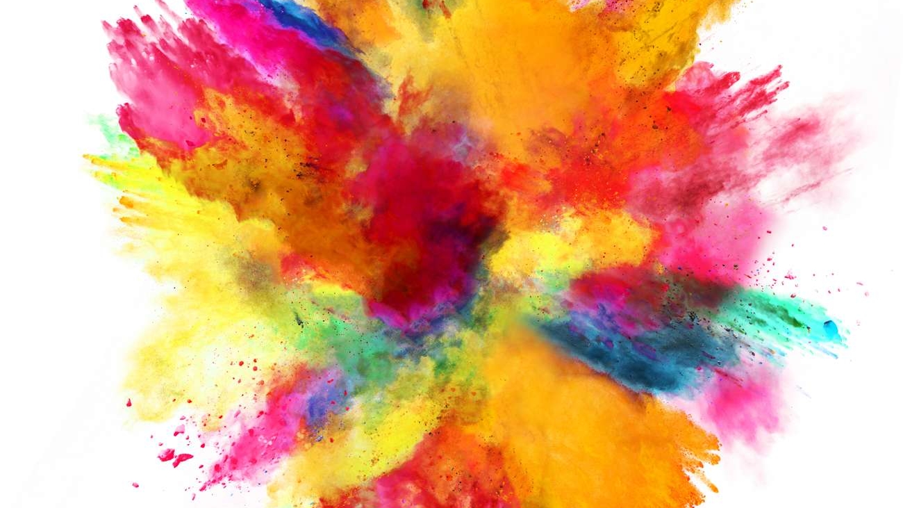
So grab your color palate and let’s get started!

Choosing The Right Colors For Your Website and Brand

The first step in any design plan is to choose your primary color.

The primary color is typically the main color used in all logos and branding, as well as for your website color scheme and highlight areas. 

This is the color people might see that makes them think of you.  A good example of that would be Whole Foods Market.  They use green on a white background and keep in mind it is always the same green, so writing down your chosen Color Codes (both hex and RGB) is crucial to ensure consistency at all times and with all creations. But which colors make sense for your business and what do they generally mean? 

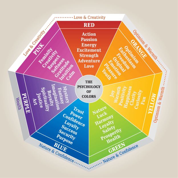
Here’s a quick guide to general colors and their typical personalities (keep in mind there are varying hues of each color):

Overtones: wealth, health, tranquility, nature, growth, freshness, earth, sincerity, wisdom

Actions: healing power, suggests stability and endurance, beneficial to mind and body healing, slows metabolism producing a calming effect Brand Examples: Whole Foods Market and Animal Planet TV

Overtones: youthfulness, optimism, happiness, honor, loyalty, intellect, energy

Actions: produces a warming effect, stimulates mental activity, generates muscle energy, indicates honor and loyalty, attention-getter

Examples: National Geographic and Best Buy

Overtones: friendliness, enthusiasm, creativity, joy

Actions: combines energy or red and happiness of yellow, gives a sense of sunshine and the tropics, creates encouragement and stimulation

Examples: Payless Shoe Source and Harley Davidson

Overtones: passion, energy, urgency, excitement, vibrancy, danger, determination

Actions: enhances metabolism, increases respiration rate, raises blood pressure, attracts more attention than any other color

Examples: Kmart and Coca-Cola

Overtones: femininity, sweetness, innocence, fertility, romance

Examples: PINK by Victoria’s Secret and Barbie

Overtones: royalty, wealth, success, wisdom, ambition

Actions: combines the stability of blue and energy of red, conveys wealth and extravagance, associated with wisdom, dignity, independence, mystery, and creativity

Examples: Qatar Airlines and Crown Royal

Overtones: trust, security, stability, peace, calm

Examples: American Express and Dell Computers.

White

Overtones: light, goodness, innocence, purity, virginity

Actions: signifies safety, purity, and cleanliness, has positive connotations, represents a successful beginning, considered the color of perfection

Examples: No singular example as white is often a background choice in logos and schemes

Overtones: neutral, simplicity, calm, futuristic, logic

Examples: Apple Computers and Mercedes Automobiles

Black

Overtones: luxury, power, sophistication, elegance

Actions: denotes strength and authority, considered formal and elegant, can be a symbol of grief, a color of mystery

Examples: Rolls Royce and Chanel

With the above general ideas of colors and their meanings in mind, which ones make sense for your brand, or how you’d like your visitors to feel when they visit your site?

You want the colors chosen to POP, above all else, and to really highlight where you want your visitors’ focus to be.

With that in mind, it’s good to know the best places to use them. Color has the ability to attract a lot of attention, so you may not want to use it everywhere, just in key places like your logo.

Within your website, these colors should highlight call-to-action areas and any clickable buttons, menu tabs, and titles or headlines on your various pages.

Another important color choice is the accent color. This color must complement your primary color to aid in giving it support and adding some extra oompf.

Don’t be intimidated by trying to match your color choices well. Sure, it’s not easy, but with a good general understanding of color theory, you’ll do just fine. 

A great shortcut that can be used is this fabulous FREE color matching tool by Adobe to help you feel like a pro: Adobe Color CC

It may look complicated, but it’s really very simple to use and will make finding your complimentary color(s) a breeze.

Things to keep in mind for accent colors are:

  1. They should not serve to be a main focal point, but only to compliment so that your primary color pops well.
  2. Try not to use more than 2 accent colors. Too many colors will create a diluted primary color, which is not the goal.  It will serve to confuse visitors and create that hectic feeling you want to avoid for them.
  3. Use accent colors for your menu tab links, subtitles, and secondary information sections.

Now for the all-important background color!

Picking a background color for your website is much like choosing wall colors for the interior rooms of your home.

The goal is to choose wall colors to make any given room feel good and soothing so that you want to spend time in there.  But you don’t want it to be boring so that the room feels void.

Strive to make your background color a comfortable browsing environment like any inviting room might be.  Choose based on the general theme of your business.

Further Color Tips For Better Conversions

As we’ve discussed, colors can be tricky to fine tune!

You want to use them right for your project and also for your audience in order to fulfill your purpose.  THAT is the tricky part and it’s multi-faceted.

Here are key results found from various studies conducted on the topic of Color Psychology.

These points can serve as tips in your quest to choose the very best possible colors for your particular purpose:

  1. Gray, orange, and brown are surveyed female deterrents. It seems they prefer blue, purple, and green.
  2. Purple, orange, and brown are frowned upon by most men, but they do seem to like blue, green, and black.
  3. BLUE cultivates trust for both genders.
  4. GREEN is ideal for environmental statements/products.
  5. ORANGE is FUN and can create impulse (good for selling things)!
  6. BLACK adds a sense of luxury and value.

While there is clearly no one-size-fits-all when it comes to color choosing for all audiences, the points listed in this blog can at least give you a deeper understanding of the possible impact of the choices you do make on them.

We hope that these tips and general guidelines will help provide a place to start and a format to follow when choosing the best colors for your venture!


Would you like some help choosing your colors? We are happy to help!

Contact us or Schedule a Call

Virtual-summit-AdobeStock_55125817-compressed

Laying Out An Engaging Welcome Campaign…and actually making your readers feel welcome!

You have attracted subscribers! Yay!! Congratulations.

 …and you want to send them emails right away to engage their attention, right?

Of course, you do. The answer is YES here (in case you sat there wondering for a moment).

Is mapping out your welcome sequence something you’ve taken into consideration already, or even completed? Have you set up or planned a winning welcome campaign?

One that says hello to your new subscribers, thanks them for joining you, and offers them something great just for joining your list?

If your answer is YES, then you don’t need to read this article… unless you’d like to enhance the plan you’ve already set up.

If you answered NO to any of the above, believe me when I say: YOU ARE NOT ALONE.

A good welcome campaign plan is imperative, and there are at least 5 emails that should be set up initially, on timers to go out strategically.  Typically every few days or so right at the beginning.

Seasoned or newbie, this is key to successful email marketing.  And we’re here to show you how to do it!

So get comfy, grab a cup of coffee or tea, and let’s get started.

Email #1: Welcome New Members!

This email should be the most engaging. It will also be the most fun to write! But it will take the most work because it will be the longest one in our sequence.

This is where you welcome new members and thank them for joining.

Below the welcome greeting, you should re-introduce yourself and your company/purpose.

Talk about your business but don’t get boring or too wordy.  Just give them the gist of it, make it colorful and fun, all the while keeping things short and sweet.

Example:

Hello <name>,

I wanted to personally reach out and thank you for joining our list.

Here at <company name>, we strive to offer the very best in <talk about your business and how it might benefit them briefly>.

<Add an image>

As a subscriber, you can expect to receive <list of what you typically send out so they know what to look forward to via email>.

Once again, we’re thrilled you’ve decided to join us and look forward to interacting with you.  Please do not hesitate to write with any questions or concerns.  We’re here for you.

Warmly

<name>

Email #2: Quick Question…

This is one of my personal favorites because it gets to be a question-and-answer sequence.  Interaction with potential customers is always a good idea!

You are definitely engaging your readers by asking them a specific question, and including a web form that takes them to your website landing page and gets them to participate. 

The email body is very short, for example:

What would you say is the biggest obstacle in life that’s keeping you from reaching your goals?

This type of “quick question” serves two purposes.  It gets them to click AND it gives you information about them: who they are and what they’re after as your potential customer.

The question is followed by a colorful, hard-to-miss call-to-action button, they click through on it (in a perfect scenario), land on a beautiful web form you’ve created, and the rest is saved for future interactions and promos. 

Voila!  You’ve learned something new about your newest subscriber(s), PLUS you can utilize tags to put them into any specific sequence(s) that might pertain to the question… to keep them engaged. 

Tricky, but clean capture! You asked, they willingly answered, and you’ve formed an ongoing relationship with them as a result.  Good work!

Email #3: Newsletter Subscription Preferences

This email will give them a chance to downgrade their subscription if they’d prefer. And also gives them a sense that you care about NOT inundating them with emails.

First, remind them of what they can expect to receive from you each day, week, or month. Give them a glimpse into your general plans for them.

A good way to do this is by segmenting your email lists.  Break your content offerings down into sections with fancy titles and blurbs, like this:

Your choices for subscriptions:

___ The Whole Enchilada: If you subscribe to this list, you will get any and everything we put out, including store offers, general newsletters, event listings, blog articles, and affiliate promo opportunities. You can expect 2-5 emails per week.

___ Half Sandwich & Cup o’ Soup: This list will feed you general newsletters (to include event listings), blog articles, and special store offers. Expect no more than 1 email per week.

___ Side Salad: With this list, you’ll get the bare minimum: blog articles and event listings.  Expect about 2 emails per month.

This segmentation is done in case they didn’t read the fine print when joining your list in the first place, and many do NOT so assume they didn’t.

You should have them tagged for The Whole Enchilada upon joining in the first place, but giving them choices after the fact is a nice thing to do, and they may or may not downgrade.  But YOU look good. 

Overall, it’s a nice, friendly gesture.

If you don’t have segmented lists – you might say something like:

We currently send out weekly newsletters, which typically include current and upcoming events, promos/featured products, FAQs, and our blog articles.

If you’d prefer a monthly newsletter that highlights the top features of the month only, click here.

Two choices.  Nice and simple.

Email #4: Resources

In this email, you will invite them to visit you online! Fun!!

Take them to your blog (choose a popular topic so they feel extra engaged), give them a tour of your beautiful online store and all its offerings, show them your Facebook group and ask them to join and discuss questions amongst peers.

INTERACTION IS KEY TO ENGAGEMENT.

I’ll say it again: Interaction is key to engagement.

This is a good time to be social with them, so make the email sound as if you’re inviting them to a special invite-only party! Make it sound fun. Strive to make it something you’d want to attend. 

Example:

Hey, <name>:

Are you a social butterfly? 

We have a great online community on Facebook that would love your presence.  Join the fun! 

Also, if you haven’t already, make sure to take advantage of reading our various blogs.  There is a plethora of information about <something that describes your particular niche> right there for you to browse. 

We’ll see you online!

Email #5: Give them something gooooood

Do you have an informative eBook?  If you do, this is a PERFECT thing to give them for free.  No strings attached.

And everyone, I mean EVERYONE, loves freebies. 

Offer them a copy of your eBook and don’t make them jump through any hoops to get it. 

Set up the email with your cover image (3D if you have it so it looks fancy), a blurb about the eBook content, and a link to download it right there in front of them so they feel special. 

The key to remember for this one is free and easy.

That wraps up our advice on setting up an engaging welcome campaign for new subscribers.  This is also a service we provide, so if it seems daunting to you, or you’d like it expertly crafted (or re-crafted), feel free to give us a shout!  We’re here to manifest for you.

Are you stuck? Contact us or Schedule a Call

Marketing-Strategy-AdobeStock_121860295-compressed

Marketing Automation: The Importance of Email Follow-Ups

We’re here to talk about the wondrous world of automated email marketing (not to be confused with unsolicited and undesirable spam). 

Keeping your emails targeted to people who opted in to receive materials from you, and by keeping those emails personal and unique, you avoid being labeled as a dreaded spammer.

So, before you cringe at the idea of sending multiple emails to your clients that are predesigned with varying but highly specific themes, hear me out on this. 

Email is a powerful marketing tool for any size business.  And despite all the new and cool technologies and social media platforms out there, email is still the winning and preferred communication channel, hands down.

The very act of creating catchy emails to send out to prospective customers takes time, but understand that it’s time well spent and the return on this investment will speak for itself.

If done just right, with seasoned and catchy copywriting, it will create a buzz within your community and a surge in leads, click-through actions, and . . . drum roll, please . . . SALES!

So why do some people cringe when anyone brings up marketing automation or automated emails?

In the old days (and I use that term very loosely), marketing automation was synonymous with third-parties that inundated prospects with spam and blasted them with pop-up ads. Innocent, unsuspecting prospects would try to leisurely surf the web to no avail.  That sort of automation is a terrible idea and will backfire every time. 

I won’t argue with that. That sort of automation can be compared with a festering wound that nobody wants to endure.  In fact, let’s just go ahead and wash our eyes of the idea right now. *shudder*

The type of marketing we’re talking about is today’s version, which is much more elite.  Classy, even.  And majorly effective.

What exactly is great Marketing Automation these days?

Glad you asked.

Marketing Automation, done correctly, is a series of personalized follow-up emails designed to fire at specific intervals after subscribers of your list take certain actions. 

If you’ve sent one email out, and people haven’t responded, they will receive a second, even a third.  And so on . . .

It is a known statistic that on average, people must see something several times before taking action on it.

Taken from web and would like to incorporate…Actually, research has shown that the number ranges from five to twelve, but seven is a good rule of thumb. The Rule of Seven is an old marketing adage. It says that a prospect needs to see or hear your marketing message at least seven times before they take action and buy from you.

http://www.thebabyboomerentrepreneur.com/258/what-is-the-rule-of-seven-and-how-will-it-improve-your-marketing/

Let me say that again: Statistically speaking, a prospect must see an offer several times before taking action on it.

So it’s your job to make sure they not only see it but want to make the decision to act.

This type of marketing affords many benefits for your business.  Most scheduled, automated emails average over 70% higher open rates than one-offs and a whopping 150% higher click-throughs! Should we reference a source here?

The very act of designing email follow-up sequences in your application (or having an expert handle it for you) can mean your target audience is much more likely to follow through and make a purchase. 

Once set up, the entire process is automated to target your specific audience and gently move them through the whole sales funnel without lifting a finger.  Ahhhh, what bliss!  Your only job is to sit back and reap the benefits of smart business decisions in marketing.

Examples of Automated Email Sequences

When a Product is Purchased

—Purchase

When a client makes a purchase, whether online or even from your physical retail store, you can set up an email to go out automatically at a predetermined time, thanking them for their purchase and letting them know their patronage was appreciated. A little nurturing goes a long way in fostering client relationships. 

—Following a Shipment

This might be Email #2 in the above purchase sequence.  For this email, you want to let them know their item has been packed up and is on its way to them. It is a good idea to include their tracking information so they can keep tabs on their shipment progress.

—After Shipment is Delivered

This would be Email #3 which acknowledges their package was delivered. It would also take a line to thank them, once again, for choosing your product/your business for their needs.

—Follow-Up Feedback

This is Email #4 in your automated email sequence for purchases.  This email is sent about 3-4 weeks after Email #3 and reminds them, if they haven’t yet, to leave feedback on the product they’ve purchased from you. Reviews on products can bring in more sales, so this is very important to nurture. 

—Abandoned Cart Sequences

This email automation sequence would be created for any time a person is shopping your site and adding things to their cart but left without completing their purchase.  It is a great sequence to have set up because it helps you follow up on leads and oftentimes ends up with that sale being completed!

Don’t let this one slide. It can be set up with one email letting them know you’ve saved their cart and “don’t forget to complete your purchase.”  A second email sent out the next day might offer them a modest discount to complete the sale, which offers more incentive to act.  A third email could repeat the discount offer with more engaging content to invite them to click through and complete their purchase.

—Customer Appreciation Discounts/Sales Drives

This would be a sales drive you might be having storewide or on a specific product or just a customer appreciation discount offer.

Whatever the case, this is a good sequence that can be set up once, and forgotten while you do another important thing. It boosts sales in the background by setting up multiple invites and reminders for the sale.  As your audience responds, you can have the system opt them out of the drive so they’re not unnecessarily bothered, but if they aren’t responding, they’ll continue to get reminders to lure them to click through. 

This is a nurture campaign at its finest and used in marketing automation with excellent results.

The main thing to remember in any good marketing practice, as a whole, is to maintain a focus on dynamic automation. Make sure it you are dishing out rich and inviting content for your specific audience. 

Be precise and ensure that the experience is completely personalized.

Hiring an outside service is the very best way to do this, at least at first.  Not only will it build a foundation for you to build your own experience upon, but it will help you get started and you can reap the immediate benefits of such an interactive system.  We invite you to schedule a free call with Manifesting Dreams Marketing to figure out a personalized plan for your business-specific needs. 

Are you stuck? Contact us or Schedule a Call

AdobeStock_44994187-1980-compressed

How to Build and Run an Epic Membership Site

Membership sites have been around for a while, but they are getting bigger, prettier, and gaining popularity as time goes by and people understand how to make them not only awesome but truly epic.

If crafted just right, these subscription sites are worth their weight in gold.

But do you have what it takes to create and maintain that level of member intrigue?

The main goal for any membership site is to not only persuade members to join, but to convince them to stick around for a while, igniting passive income for your business.

In order for your membership site to function as a true website passive-income powerhouse, you need to be able and willing to dish out high-value content that keeps your members hungry for what you’re dishing out to them on a regular basis.

They have the structure to deliver continuous worth by way of subscription payments. But ONLY if you keep delivering the high-value goods – content – your members expect to receive for their continued support.

So how do you do it? What type of content will help ensure you’re keeping your end of the bargain? 

Let’s go over what an epic membership site should look like.

Offer Online Courses (the cream of the crop)

These are seen as the bread and butter of any epic membership site.

Creating and offering online courses, by way of single or multiple topics, is not only an excellent choice but imperative to your master plan. 

Courses can be super long with multiple modules that present over time to the member giving them a feel of a university distance course. Or, they can be short and sweet with just one thing to check off their list. 

You could even do multiple shorts instead of one long course.

However you choose to put the course(s) together is up to you, but it must be built around good, engaging content that entices members to keep coming back to learn.

Live Webinars and/or Pre-Recorded Video Lectures

Planning to go live at regular intervals pre-determined in any lesson plan is a great way to deliver engaging content to members in your time zone (or close to it).

However, that isn’t always possible for everyone, given their time zones and schedules, so it’s vital to also provide the live webinars after the fact as part of the course.  These pre-recorded sessions can then be accessed at leisure and nobody misses out.

You could also ONLY offer pre-recorded lectures if that suits your course/lifestyle better.  The live-recorded feel has its advantages, but really, so does professionally pre-recorded. It will all depend on your preference.

Webinars, whether live or pre-recorded, offer the chance to give members a classroom lecture feel, and also bring in guest speakers, further ramping up value for your content and engagement from your members. 

Live Conference Calls and/or Pre-Recorded Telecalls

This is another excellent live format that is useful for any online course. Again, this can be offered later as a pre-recorded session for members to either visit or revisit while taking the course.

The format can vary depending on your needs and the attendees, but they will be done with your members on the line and may include a Q&A session at the end, which is an added bonus for those who were able to attend real-time.

There are many programs out there for teleconferences such as GoToWebinar, Zoom, and Instant Teleseminar, all of which have excellent features.

Content Libraries / Downloads

For members unable to attend or interact at the scheduled time for live pieces should have everything available for download after the main event has taken place.

This will keep members subscribed for a longer period of time, especially as you build up your library of various pre-recorded lectures, telecalls, webinars, and general content! 

Exclusive downloads whether we’re talking software, blogs/articles, resources and tools, etc., are a high-value addition to your membership site’s Content Library.

Simply offering up neatly packaged resources for people to unravel and spend time getting themselves deep into is valuable beyond measure. With Content Libraries in place, there is an immediate back-catalog of things to do and the promise of ongoing content is alive and well.

Community Groups/Forums

Online groups where members can meet and interact is of the utmost importance with any membership site!

These communities can keep members engaged, and interacting with each other, and have the potential to keep them locked in for months and years past the point of just any one online course. 

It gives them an outlet for questions, comments, feedback/concerns, and a place to work peer-to-peer. 

Moderators should be in place to keep things in line and to answer questions on behalf of instructors. Direct instructor answers would boost value, too, and should be part of the plan. 

Let’s Not Forget Membership Perks

Offering member-only discounts on products and services offered through your regular website is another excellent perk for members who subscribe to your site.  

Everybody loves a discount. This is an absolute must if you plan to reach EPIC status. No ifs, ands, or buts about it.

Don’t Forget the Little Things (excellent ideas for stand-alone content)

Although it may seem so, online courses aren’t your only option for membership sites. 

They are large and all-encompassing but smaller things like exclusive articles, how-to videos or written tutorials, mini-courses and such other things that carry extremely high value as well!

Focus on the benefits of the benefits to resolving specific issues for various people via articles and blogs.

This will give you a deeper sense of your customers needs and offer them solutions to things that might hold them back.

Depending on your niche, a library of short content like this could be an arsenal of value.

Some things can stand alone as intended, or several pieces over time can also be incorporated into a new, full, or mini course.  Strive to keep both available as they should be designed to stand alone.

Are you stuck? Contact us or Schedule a Call

jeff-sheldon-3219-unsplash-compressed

4 Quick Tips for Choosing the VERY BEST Web Fonts for Your Site

Today we’re going to discuss web fonts. 

You can’t begin to measure all of the font options out there these days. 

Font databases are chock full of choices, from mundane to so-fancy-you-can-hardly-read, and everything there is under the sun in between.  It’s like a proverbial candy store for web designers and enthusiasts alike who tend to get stuck in a wonderland of varying typefaces.

And to add to that, new fonts are added to that wonderland every single day, so there’ll be no rest for the good little researcher.

But with all those choices comes procrastination. Who doesn’t want to spend A LOT OF TIME finding that perfect one for their project?

Not only that, but once you think you’ve found your best match, no matter how lovely or cool looking it is, how easy to read, or how bold of a statement it makes for you, is it really the right font for your website?

And what about pairing that perfect font with others without having them clash hard?

Selecting the perfect font or fonts is never easy. You have to consider so many things: compatibility, design purpose, aesthetic look and feel, blending with colors/backgrounds, voice (yes, voice because don’t you hear a font as you read it… or is that just me), etc.

Well, today we’d like to share a few tips to help you select and use the best possible fonts for your website or design project.

#1: The Basics

Remember that working with fonts for the web is just like any other typography project.  With all of the choices out there, it is really important to begin with the basics.

Sans-Serif vs. Serif


In terms of web design, pretty much every project begins with one of these options.

Sans Serif typefaces are made up of simple lines, whereas serif typefaces use small decorative marks, like little feet, to embellish characters and make them easier to read. Sans-serif seems to be the most dominating web font type.

Some Sans-Serif fonts include:

Arial
Helvetica
Franklin Gothic
Trebuchet MS
Verdana

Some Serif fonts include:

Book Antiqua
Garamond
Georgia
Rockwell
Times New Roman
Readability


When choosing your typeface, you want to make sure you’re choosing different fonts for body text versus headline text.  It can be the same font, but this is a good opportunity to use a more fancy font, so why not do just that?

Headline text can be big, bold, have space around it, and stand out from the body text.  Therefore, the choice is completely different even a little more fun than choosing a font for regular body text. 

Body text must be simple, consistent, and readable, so it doesn’t get lost in the slurry of surrounding text.

Also, numbers should be clear and easy to read, preferably the same size and set on the same line as the letter for best legibility. 

Another thing to consider is type size. Obviously careful selection of text that is not too small or hard to read will be very important so people with varying needs and devices can read it.

Good letter spacing is also imperative.  This is also referred to as tracking, which is a consistent increase or decrease in distance between letters of a word or within a block of text. 

Not to be confused with kerning, which refers to the distance between individual characters.  Letter spacing is used to adjust density of a block of text as needed.  And you will know when it is off – you want complete and uniform consistency of text for best readability. 

To keep it simple, you want to find an attractive font that you can read at various screen sizes, be it mobile device or desktop.

Text Justification

We like good old-fashioned “jagged right” paragraphs.  Many people try to get fancy using hypens, but they are actually a huge mess on screen.  Just… don’t. 

Let your right justification be staggered – and be proud! For you have foregone the temptation of the cool but messy hyphen game, and believe it or not, your pages look way cleaner as a result. 

How many fonts to use?

You can use 2 or 3 different fonts on your web site, but no more than three.  Period.  Go over three and you’ve got a chaotic site on your hands that people run screaming from because the anxiety of it got the better of them. 

Not really, but you get the point. It’s like a wrinkled shirt at an important business meeting: Just… don’t do it. You want to look better than that, don’t you? 

#2: Cool Compatibility

There are various browsers out there in Internet land these days. And with all these different browsers come compatibility issues. This can make it difficult when it comes to choosing good web fonts. 

Keep this in mind and try to select a typeface that has proven compatibility with modern web browsers – and test them across desktops, laptops, and mobile devices alike. Just to be sure.

This won’t be easy, and you may become frustrated with finding one that works across all of your devices and web browsers fluidly.  Just try to be patient and when choosing, stick to typefaces specified for web use. That will help a ton! 

And just for reference, there are the tried and true web fonts that have been around forever. They aren’t fancy, but they work everywhere. Some of those fonts include:

Arial
Helvetica
Times New Roman
Courier New
Verdana
Georgia
Palatino
Garamond
Bookman
Comic Sans
Trebuchet
Futura

But, again, with so many new choices these days, those might feel old and outdated.  Take your time, be patient, and try some catchier ones on your site.

#3 Look Around… a LOT!

Don’t make a quick decision on font choices. Scour the web! And don’t be afraid to look at suggestions, because there are a lot to consider, and many times they’ve already been tested, so that will save you time. Everyone can appreciate more time.

Have you heard of Google Fonts? One thing that Google Fonts does for us is allow the user to look at different font combinations (for pairings) and make suggestions for us! 

Nothing wrong with that either!! It does the work for you and it does it very well, thus, once again saving us time doing our own scouring.  No shame in that game at all.  Take advantage of freebies like that.

You’ll be amazed at the beautiful, simple fonts out there, outside the realm of the old-school choices.

Seek letterforms that are similar in mood, stroke, and height… think about the shape and slant of the letters, and choose those that are especially pleasing to the eye, and that easily complement each other.  Be objective. 

#4: Load times

Some fonts load slowly, and you never want that for your website visitors. 

Surfers collectively show zero tolerance when it comes to slow websites.  Gone are the days of modems! So even if your chosen font(s) are totally awesome, if your site doesn’t load in the snap of your fingers, they will do you no good.

Always, and I mean always, check for font loading speed.  If you choose to enlist a service to help you choose your fonts (like Google Fonts mentioned above) that is one of the things they will do for you.  It’s a win-win.

Another helpful resource for you to consider using when beginning the process of choosing typefaces for your design project is Typewolf.  On this page, they will list different font recommendation sites to peruse and help you get started on choosing your very best font. 

And you want to be as objective as possible because the font you use represents YOU.  Be Choosy. It’s your right.

4 Quick Tips for Choosing the VERY BEST Web Fonts for Your Site. We hope it’s been helpful for you!  Remember that Manifesting Dreams Marketing knows good fonts, too!  So if you’re stumped, uninterested in scouring yourself, or just know you need help putting up the very best representation of your business that you can, don’t hesitate to schedule a consultation with us ABSOLUTELY FREE!

Are you stuck? Contact us or Schedule a Call

Picture 111

For the Love of Graphics!

We love graphics.  Especially free ones!! 

Who doesn’t?  In this article, we’ll show you how to quickly find the perfect image for all your designs. 

Imagine yourself sitting at your workstation. You have a clear idea in your head of that one, killer image that you need for a project you’re working steadily on.  The only image that will complete your design.  And, perhaps you’re creating something for a client who is being impatient and needs it yesterday. 

Fear not!  Pexels is chock full of the very best free stock photos in one place.  Chances are, you’ll find what you need there.

Easy peasy.

But . . . wait. There’s more.

Pexels isn’t the only trick in our hat.  There are other great sites out there loaded with perfect images just sitting there, waiting for you to download and use.

There’s also Pixabay, where they report to have millions of free images at your fingertips; StockSnap, where they offer hundreds of free, high-resolution images (with more added weekly); and let’s not forget about PicJumbo where they offer to deliver free images straight to your inbox to consider.

As you can see, there are a handful of great sites just waiting for you to partake of their resources.  Oh, and we absolutely love Unsplash

The sites above offer completely free and high-resolution stock photos.

And since you don’t have to spend any money on them, spending a fair amount of time perusing them shouldn’t be an issue. But that’s a given, because good things take time. 

What else do you need?

just in case you can’t find what you are looking for and you need more of a premium image, you can try shutterstock, istockphoto, photodune, 123RF, etc. But be prepared to spend a pretty penny for some. if you need a custom graphic, you can hire MDM and we can create all that you are envisioning!

So now that you’ve got the inside info, we’d like to offer a few tips on getting the job done quickly and on point.

#1: BE SPECIFIC.

This might be the fallback of many great graphic designers.  Not being specific and focused on the graphic they need, thus wasting time and energy on their search.

The discouragement mounts when you aren’t finding what you need.  Let’s see if we can resolve that before it happens.

Sometimes, finding the right image is all about proper visual comparison.  You have references, you have the image in your head, and perhaps you’ve got previous renditions of the design you are working on. 

Well, all of the above image resources offer great search tools, so focusing on the image you need, refining your keywords, and trying not to search too broadly will go a very long way.

For instance, looking for the word “girl” would produce tens of thousands of results.  Maybe more!  You must be more specific. 

If you’re looking for a girl with her arms raised at the beach, then make your search: “girl beach, arms raised.”

You will still get a large amount of results, but they will actually be of girl at the beach, and chances are, your image will be waiting for you there.  Boom.

#2: GET TO KNOW THE REFINE SEARCH TOOL.

Now that you have a girl at the beach with her arms raised staring at you, you might want to define more specific components that further refine your search.  This can bring up the images within your current search that are more in tune with exactly what you need. 

You might indicate if you need a vertical, horizontal, or panoramic image for your design.  With this one, simple refinement, you’ve further narrowed down your search results and have a better chance of finding that killer image you need. The one that makes your design.

#3: MIX IT UP.

So even though you started your search with the perfect image in mind, you might not have known what you actually needed until you saw it before you. 

Image discovery is an intuitive process, and you might not nail it until you’ve glanced through your refined search results.

Once you’ve done that, using the above tips, you’ll be surprised at the effectiveness of shuffling those results up a bit. 

Play around your results.  Switch between the options in the refine panel: Best Match, Newest, and Most Popular to get different impressions.

Best Match is your chosen graphics site’s recommendation based on the factors you’ve defined for your search. If you’re limited on time, this might be your best bet.  They’re pretty good at this, actually.

Newest is self-explanatory and will just show you images newer to the site. No particular matching strength except it fell under your commands of refinement.  😉  So there’s that.

Most Popular is going to display images that have been downloaded most by users of the site.  This gives you reassurance that the images were perfect for other great designers like you, passing filters and refinements with flying colors. 

That said, they might be images you’d see elsewhere more often than not merely because of their popularity.  So unless you feel they are IT, Best Match might be the perfect medium for you.

Are you stuck? Contact us or Schedule a Call